The equity risk premium for stocks is incredibly low … what the S&P’s CAPE level suggests for 10-year returns going forward … trouble in the yield curve … is trading the best way to handle all this?
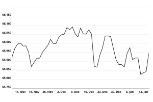
Check out the chart below. Pretty good, right?

Well, see what you think when we pull back.
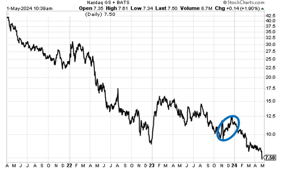
Below is the same stock chart but over a wider timeframe. I’ve circled the uptrend from above.
Today, there are all sorts of market-related mini-stories that we could zoom in on: earnings, the timing of a rate cut, AI, the upcoming election, geopolitical conflict, you name it.
But a narrow focus can miss the big picture.
Today, let’s pull back to get a wide-angle view on where we are. We’ll cover three ways to analyze the forest, not the trees.
In short, does the forest remain healthy, or is it already on fire?
What we learn by looking at the equity risk premium
Stocks aren’t the only game in town.
There are bonds, real estate, cryptos, private equity deals, foreign assets, commodities, you name it. At the end of the day, what’s important to investors is receiving the highest risk-adjusted return, or yield.
For our purposes today, we can rephrase this as “after the blistering rally since last fall that now appears to be running out of steam, how attractive are stocks as an asset class, relative to risk-free treasuries?”
We answer this by calculating the equity risk premium (ERP). The ERP shows us how much extra return stock investors are demanding beyond the return they can get from risk-free investments (U.S. bonds).
Comparing the size of today’s ERP to its long-term average gives us a sense for whether stocks are offering us a good relative deal today.
To do this, we start with the yield of our risk-free asset, which is the 10-year Treasury note. As I write Thursday mid-morning, the 10-year yields 4.64%.
Next, let’s figure out the overall yield from the S&P.
We start with the S&P’s earnings yield. This is just the inverse of its price-to-earnings (PE) ratio. According to Multpl.com, the S&P’s PE ratio is 27.34. So, when we divide “1” by “27.34” that gives us 3.66%.
Now, let’s factor in dividends. According to Multpl.com, the S&P’s current dividend yield is 1.41%.
Combining the S&P’s earnings yield and dividend yield gives us a total yield 5.07%.
So, we have two choices: the 10-year Treasuries note yielding 4.64% or the S&P yielding 5.07%
At face value, stocks have the edge because they yield about 40 basis points more than bonds.
But remember, this isn’t an apples-to-apples comparison because the risk levels aren’t the same. If an investor holds that 10-year note to maturity, there’s zero risk of principal loss (unless our government implodes). A stock investor has no such assurance.
The way to analyze this differential in risk, and what that means about the attractiveness of stocks, is by comparing our current ERP to the long-term average ERP.
So, we take our total S&P yield of 5.07% and subtract the risk-free yield of 4.64% to give us a current ERP of 0.43%.
Is this good or bad?
Well, though it bounces around, the 20-year average ERP is roughly 3.68%.
The quick takeaway is that stock investors are getting horribly shortchanged today by the amount of risk they’re taking in the stock market relative to the amount of risk they’ve taken historically.
In February, Bank of America looked at the ERP of the S&P 500 relative to the 3-month T-bill. Its takeaway was that this ERP had eroded to its lowest level in 23 years.
Bottom line: at a big-picture level, the stock market is not very attractive.
For our next tour through the forest, let’s look at the U.S.’s CAPE ratio relative to the rest of the world and historical averages
“CAPE” stands for “cyclically adjust price-to-earnings” ratio. It’s a long-term measure of a market’s valuation. It’s the traditional price-to-earnings ratio of a stock but it uses rolling 10-year average earnings to smooth out business cycle fluctuations.
The CAPE ratio isn’t a market timing tool. But it does offer investors a helpful and remarkably accurate expectation of long-term forward returns.
This happens because markets tend to mean revert over time. So, a stock or index that has a high CAPE value today is more likely than not to see its value fall in the coming years. That would mean below-average stock returns should be expected.
On the flip side, a stock or index that has a low CAPE value today is more likely than not to see its value rise in coming years. And we should expect above-average returns.
The more extreme the starting CAPE value (either high or low), the more pronounced those ensuing 10-year returns often are.
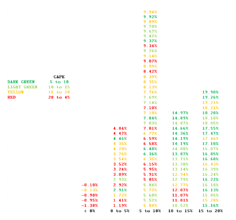
Below is a chart from my friend and quant investor Meb Faber, CIO of Cambria Investments. Starting in 1900, the chart shows initial CAPE values of the S&P and what the ensuing 10-year returns were after beginning at the specified CAPE value.
Dark green represents the cheapest CAPE starting years (CAPEs between 5 and 10).
Red represents the most expensive (CAPEs between 20 and 45).
As you’ll see visually, most of the “green” starting years (low CAPE ratios) end up on the right side of the chart — meaning big 10-year returns.
On the flip side, “red” starting years (high CAPE ratios) usually end up on the left side of the chart — meaning low and negative 10-year returns.
So, what’s the S&P’s current CAPE value?
33.45 – the second highest level since the Dot Com peak, and deep into the “red” bucket of dangerous starting valuations.
For added perspective, Meb just updated global CAPE values. The median CAPE ratio of countries aroud the world is 16. So, the U.S. is twice as expensive.
Even if we narrow the global market list down to evaluate only the 25% most expensive countries, that line-in-the-sand CAPE value is 27. In other words, the U.S. is 24% more expensive than the starting line for what counts as “expensive.”
Bottom line: again, not great for the big picture.
For our final analysis of the forest, how will the yield curve drama resolve itself, and what does that mean for stocks?
So far, we have two macro variables suggesting that U.S. stocks aren’t trading at the most attractive of valuations.
This doesn’t mean stocks are going to crash. An expensive market can become nosebleed expensive, making bolder investors extremely wealthy to the great frustration of cautious investors who got out of the market.
(This is why we suggest investors ride a bullish trend for as long as possible, even if they’re skeptical of why the market is rising.)
The issue becomes “are there any ‘matches’ that might spark a blazing fire anytime in the foreseeable future?”
That brings us back to the treasury market. But this time, we’re going to assess what the “un-inverting” of the yield curve might mean, which is what’s happening today.
To make sure we’re all on the same page, a yield curve is a graphical representation of the yields of all currently available bonds, from short-term to long-term.
In normal times, the longer you tie up your money in a bond, the higher the yield you would demand for it. So, you’d expect less yield from a 2-year note and more yield from a 10-year note.
Given this, in healthy market conditions, we usually see a “lower left” to “upper right” yield curve.
But when economic conditions become murky and investors aren’t sure what’s on the way, the yield curve tends to flatten.
And if the curve inverts, history has shown that it is a highly accurate predictor of recessions, though the timing of those recessions varies. From Reuters:
Yield curve inversion is a classic signal of a looming recession.
The U.S. curve has inverted [6 to 24 months] before each recession in the past 50 years. It offered a false signal just once in that time.
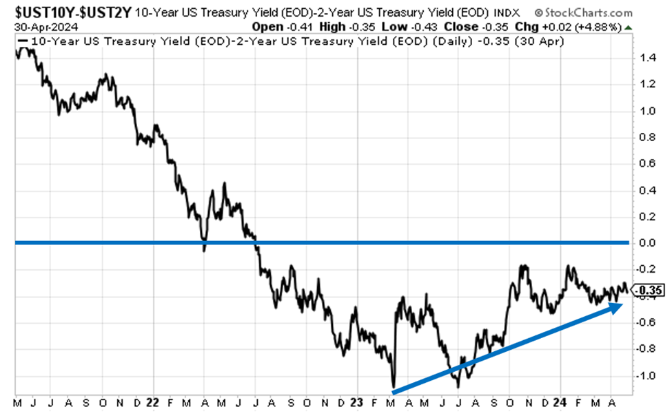
The most widely watched yield curve inversion involves the 10-year and 2-year Treasury notes. This part of the yield curve has been inverted for nearly two years. In fact, as of March, this inversion set an all-time record for the longest continuous inversion of the US 2s10s.
Now, even though this curve is still inverted, it’s been moving closer to “un-inverting” in recent months.
Below is a chart showing how this looks. I’ve added a blue line at “zero” to help you see this dynamic easier, as well as a trendline.
But this isn’t the match that risks setting the forest on fire.
The match is how this inversion finally becomes “un-inverted,” which will happen eventually.
There are two ways this un-inversion could play out
For the yield curve to un-invert, short-term yields need to move below long-term yields.
This can happen in two ways:
- Short-term treasury yields fall faster than long-term treasury yields, which remain more constant. This is called a “bull steepener.” As the name suggests, the stock market would respond favorably to this. This dynamic would play out most likely based on rate cuts from the Fed.
- Long-term treasury yields climb higher/faster than short-term treasury yields, which remain more constant. This is called a “bear steepener.” Again, the name provides a clue about how stocks have historically responded to this dynamic. This is because a soaring 10-year Treasury yield often acts as a wrecking ball against stock valuations.
So, what’s happening right now? Which end of the yield curve is moving faster than the other?
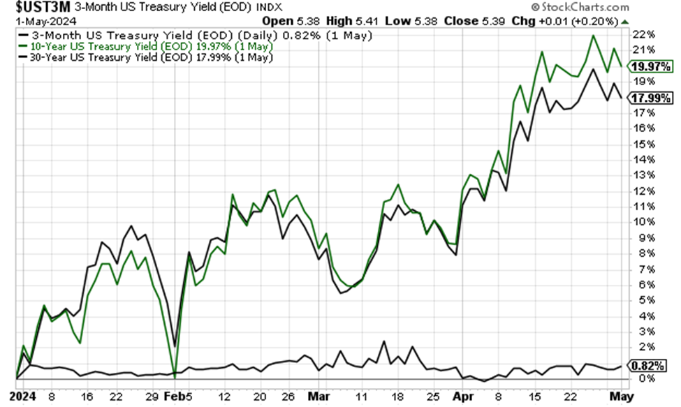
Below, we look at a chart comparing the percentage changes of the 3-month Treasury bill, the 10-year Treasury note, and the 30-year Treasury bond since the start of the year.
Spoiler: The 10-year note and the 30-year bond are up 20% and 18%, respectively. Meanwhile, the 3-month bill hasn’t even climbed a full 1%.
Translation: As it looks right now, we’re seeing a bear steepener.
Bottom line: You know where we’re going here.
So, what’s our big-picture, macro takeaway?
It’s not great.
Clearly, stocks have valuation headwinds, as well as problems in the yield curve.
Now, a bull could play solid defense against parts of these arguments. For example, the near-zero ERP is heavily influenced by the lofty valuations of some Big Tech stocks, which have an oversized impact on the market’s valuation.
And the CAPE ratio has been at elevated levels for years. Using it as a timing tool would have been an awful decision for the last decade, robbing investors of fantastic stock returns.
Finally, the inverted yield curve might have a happy ending if the Fed gives us rate cuts.
But…
Let’s invert the question.
While bulls might be able to poke holes in the idea that stocks will fall based on these issues, can we really argue the opposite? Are stocks attractive and poised for a multi-year bull run from today in spite of these issues?
From a broad market perspective, we’re skeptical.
Of course, as we frequently write here in the Digest, it’s not so much a “stock market” as it is a “market of stocks” with wildly different fates and fortunes.
So, the conclusion of today’s Digest isn’t “get out of the market,” but rather, the market doesn’t look great with a wide-angle lens, so make sure you’re comfortable with your specific portfolio holdings and be sure to mind your stop-losses if things turn lower.
There’s one final angle
You don’t have to marry the market.
We’ve discussed trading a great deal here in the Digest in recent weeks.
We’ve covered Eric Fry’s long-dated options trades in The Speculator… Luke Lango’s quant-based Stage-2 breakout trades using either stocks or altcoins in AI Trader, High Velocity Stocks, or Crypto Trader… and Jonathan Rose’s options trades in Masters in Trading Live.
By the way, if you missed my recent interview with Jonathan, click here . And next Wednesday, May 8 at 10 am ET, Jonathan is holding his first ever Masters in Trading Summit. If you’re new to trading and want an overview of some of the best, most profitable ways to approach the markets, this is for you. You can reserve your seat by clicking here.
Trading enables you to be opportunistic – taking advantage of whatever the market is giving you. That way you’re directionally agnostic.
The market rises? Great, you have a trade. The market falls? Great, you have a trade.
To be clear, I’m not suggesting anyone gets rid of their core, long-term stock holdings. If you own great stocks and have plenty of time until you need to cash them in, leave them alone.
But if you have fresh capital and don’t feel great about investing it for the long-term today, then don’t. Consider a shorter-term approach that enables you to ride market direction, instead of getting ridden over by market direction.
In any case, be aware of how the big picture looks today. We’re a loooong way from bargain valuations that suggest we’re in a “rising tide lifts all boats” stock market.
Have a good evening,
Jeff Remsburg

