The historical bad performance of September … might upcoming bumpiness be seasonal or fundamental? … a walk through “records/extremes” today
If we go by history (and yesterday), September is likely to be bumpy.
Over the last 95 years, the S&P has recorded a September gain 42 times. In the remaining 53 losing years, the S&P has suffered an average decline of 4.7%.
The last three Septembers have been especially rough. Here’s a quick trip down memory lane:
- 2021: -4.8%
- 2022: -9.3%
- 2023: -4.9%
Given these numbers, we should be mentally prepared for volatility without jumping to the conclusion that the sky is falling. After all, as we’ve pointed out in past Digests, while September and sometimes October are often painful, November and December usually produce fantastic returns.
But there might be more than just seasonal weakness in our future this time around
This is where things get a bit more challenging.
On one hand, if stocks pull back this month, as we just pointed out, history suggests that’s just par for the course.
On the other hand, we’re in an unusual market/economic environment that is anything but “par for the course.”
In fact, we’re at records and/or extreme levels in quite a few indicators and/or market characteristics (I’ll show you a handful of them in a moment). That doesn’t mean the gains can’t continue, but it does suggest instability.
So, if stocks begin falling, how will we know whether it’s seasonal weakness to ride through confidently versus something more sinister to sidestep?
Before we answer that, let’s look at some of this “instability” to help us contextualize where we are today.
We’re nearing the highest reading ever of household allocation to stocks
Let’s go straight to Global Markets Investor:
US household allocation to stocks as a % of total recently reached 57%, near the highest level ever recorded.
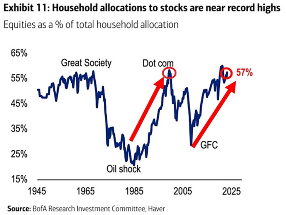
The percentage has more than doubled in ~15 years and is now in line with the 2000 Dot-Com Bubble Peak.
As we’ve detailed in past Digests, such an outsized allocation to stocks is often a warning sign. That’s because when a record number of people own stocks, there are simply fewer people available left to continue buying stocks. But buying pressure is what pushes prices higher.
From Stéphane Renevier from Finimize:
A lot of things can influence short-term stock returns: interest rates, economic data, geopolitical stuff, investor sentiment – even weather.
But for long-term returns, one factor rules them all: the proportion of assets that investors are parking in stocks.
This ratio has proven to be the most reliable predictor of stock returns over a ten-year horizon, outshining even heavyweight factors like valuations.
It says that when investors go big on stocks, their long-term returns tend to be below average…
Yes, the percentage of Americans owning stocks can keep climbing. But statistically, the odds aren’t great. We’ll circle back to this momentarily.
Meanwhile, we’re now in the most concentrated market of all time, topping the Dot-Com bubble
Last week, The Kobeissi Letter reported that the percentage weight of the technology, telecom, and healthcare sectors relative to global stocks just hit a record 45% in July 2024.
This level has jumped by about 10 percentage points over the last four years. This latest 45% reading tops the previous all-time heaviest weighting of 44% set back in the year 2000 at the height of the Dot-Com bubble.
Meanwhile, the percentage weight of the financial, energy, and materials sectors relative to global stocks has fallen to 25%. That’s nearly at 2000’s level of 24%.
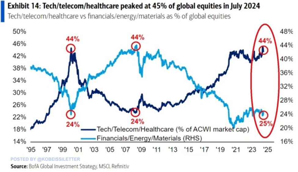
Again, this doesn’t signal a market crash, but it does point toward elevated market instability.
Over in housing, whether it’s a bubble or not, we’re at the highest inflation-adjusted prices of all time
According to Nick Gerli, CEO of Re:venture Consulting, inflation-adjusted home prices are now nearly double their 130-year average.
Here’s what this looks like:
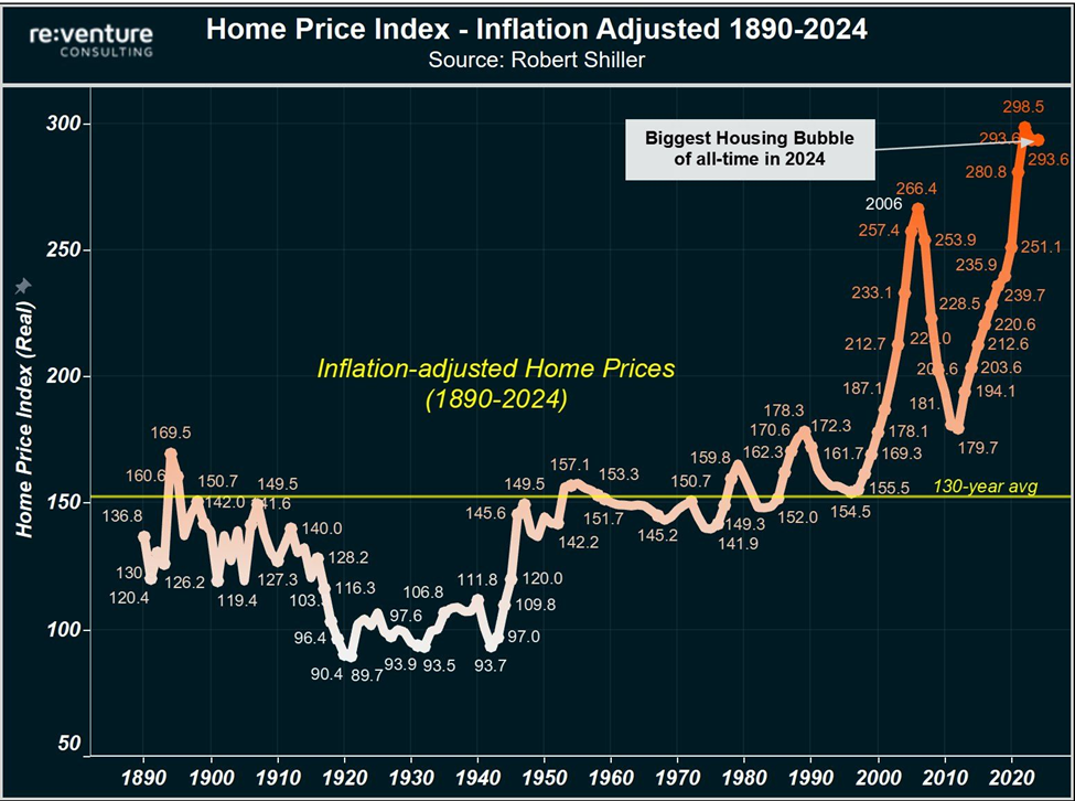
We are in the biggest housing bubble of all time…
Only 2x in US history where this has ever happened: 2006 and right now.
Another way to look at this is by comparing home price appreciation to real income appreciation. In a healthy economy, we would find this ratio remaining relatively constant, or even tilting toward real incomes rising faster than real home prices.
Unfortunately, we find the opposite today. Beginning our analysis in 1970, real home prices are up 102% while real incomes are up just 26%.
Back to Gerli:
his situation is not sustainable.
Home prices must crash, or inflation needs to skyrocket out of control. Or perhaps some combination thereof.
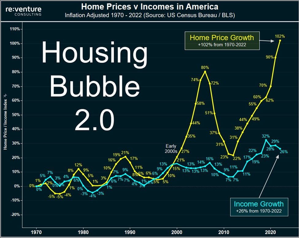
Now, I disagree with Gerli when he speaks of a bubble.
I’d be more inclined to call it such if the same number of dollars from, say, five years ago had all been funneling into the housing market. But that isn’t what happened.
Remember that tsunami of freshly printed cash from the government that flooded our economy? Well, a huge chunk of it flowed into the housing market, resulting in a one-time price reset higher.
For a visual on this, below, let’s look at the M2 Money Supply. This is a measure of the total money supply in the U.S. that includes cash, checking, and savings deposits. You’ll see it exploding higher in the pandemic (in blue).
Trailing it by about one year is the Median Sales Price of Houses Sold (in red) exploding higher in loosely parallel fashion to the M2 Money Supply.
In essence, we’re seeing the government-sourced increase in currency hitting the economy and personal savings/checking accounts, then falling as consumers funnel it into the housing market, which pushes housing prices higher.
The chart, which measures the percent change from the prior year, begins in 2015 to give you some context.

To me, this deflates the “housing crash” thesis. After all, this money is now officially in our economy. So, barring a monster deflationary recession, home prices will likely have a “new normal” higher baseline going forward.
But that doesn’t mean this isn’t destabilizing…
The widening divergence between the “haves” and “have nots” (such as “who can afford a home?”) is adding to instability
Thanks to our record stock market run, the number of 401(k) millionaires has now jumped to all-time highs.
Below, we look at the number of 401(k) accounts at Fidelity with balances greater than $1 million. As you can see, it’s the highest on record.

But while the net worths of these “haves” continues climbing, the financial stresses of the “have nots” is accelerating.
The chart below from ZeroHedge shows credit card debt hitting record highs while the savings rate notches a record low.

And even though the number of 401(k) millionaires is at an all-time high, the averages reveal a very different takeaway.
Here’s CBS News:
Although there are more 401(k) millionaires than ever, research shows that most Americans are woefully unprepared for retirement.
Overall, the average 401(k) balance is just over $127,000, although that’s up 13% compared to a year ago, according to Fidelity.
The typical U.S. worker estimates needing savings of nearly $1.5 million to retire comfortably, according to an April survey by Northwestern Mutual.
At the same time, only 1 in 5 people who are 55-years-old have $447,000 or more saved for retirement, according to Prudential Financial data. And another recent study on Gen X’s retirement readiness found that half of those surveyed believe it would take a “miracle” for them to be able to retire.
Noted retirement expert Teresa Ghilarducci, a labor economist and a professor at The New School for Social Research in New York, also has noted the gap between rich and poor when it comes to retirement.
“At the lower end, the typical person has 12 years in retirement, and at the higher end the wealthy are retiring for about 20 years,” she told CBS MoneyWatch earlier this year.
This “have” versus “have nots” reality is what’s behind the snowballing volume of memes such as the one below.

Circling back to our earlier point about record ownership in stocks, how likely is it that someone like the hypothetical person in the meme above – working three jobs and still having trouble with rent – is going to begin buying stocks today?
This calls into question who will keep driving prices higher as the percentage of stock ownership now sits just under all-time highs.
And if your reply is “that record mountain of cash on the sidelines will flood the market, driving prices higher for quarters to come,” we called that idea into question in this Digest.
Now, we haven’t even mentioned record purchases of gold from central banks (and gold’s recent all-time high), record debt from global governments, and record unrealized losses on bank balance sheets…
We also haven’t included the inverted yield curve which finally flattened earlier today. This is a classic “starting gun” signal for a recession. We’ll save this analysis for tomorrow so that we don’t run too long today.
The overall point is simple…
We’re enjoying a great year in the stock market, and we want to stay with this bullishness for as long as it’s here; however, there’s growing destabilization under the surface.
This doesn’t mean get out of the market, but it does suggest you need to assess your portfolio to determine which stocks are high-conviction holdings, meaning you won’t sell them regardless of what happens this month or next…
Versus which holdings are more speculative in nature, suggesting you need to identify appropriate stop-losses to protect your wealth if “instability” results in selling pressure that’s more intense than normal, seasonal weakness.
This preparation helps you accomplish two things: you remind yourself of why you own your fantastic core holdings, which stops you from selling them based on fear…
And you know exactly when/why you’ll sell your speculative plays, which enables you to stay in them for however high they climb, until the tide turns.
On this last note, yesterday, we introduced you to Luke Lango’s trading approach in Breakout Trader. It involves a market framework called stage analysis. And if you want to keep trading today’s market while putting protective frameworks in place, it’s a great option.
For more on this, circle Wednesday September 11th on your calendar. That’s when Luke will provide more details about how it all works. We’ll bring you more in the coming days, but you can lean more right now by clicking here.
Wrapping up, let’s circle back to the question at the top of today’s Digest…
If September is true to form and stocks begin piling up losses, how will we know whether it’s seasonal weakness to ride through versus something more sinister to take seriously?
Fortunately, we don’t have to know.
For your core positions, you’re going to hold them regardless. And for your speculative plays, you’re going to stay with them as long as your trading system and stop-losses allow.
Either way, a little preparation now will prevent today’s “instability” from derailing the achievement of your investment goals.
Have a good evening,
Jeff Remsburg

